Sprout Social Wayfinding System
Bringing clarity and flexibility to a multi-location wayfinding system
Wayfinding, Iconography, Design System, Environmental Branding, Signage
As part of my role leading the environmental branding for Sprout’s offices in Chicago, Seattle and Dublin, I also developed a wayfinding and spatial identification system to bring both clarity and flexibility to the space’s functionality.
The room signage system was fabricated out of die-cut acrylic, while the wall maps and conference room names are in adhesive vinyl, allowing for easy updating as the space evolves to meet the team’s needs.

I drew inspiration from the 1-color line art version of Sprout’s logo, as well as the material and colors in the physical architecture, to develop a minimal, geometric icon system which was applied to navigational maps and signage.


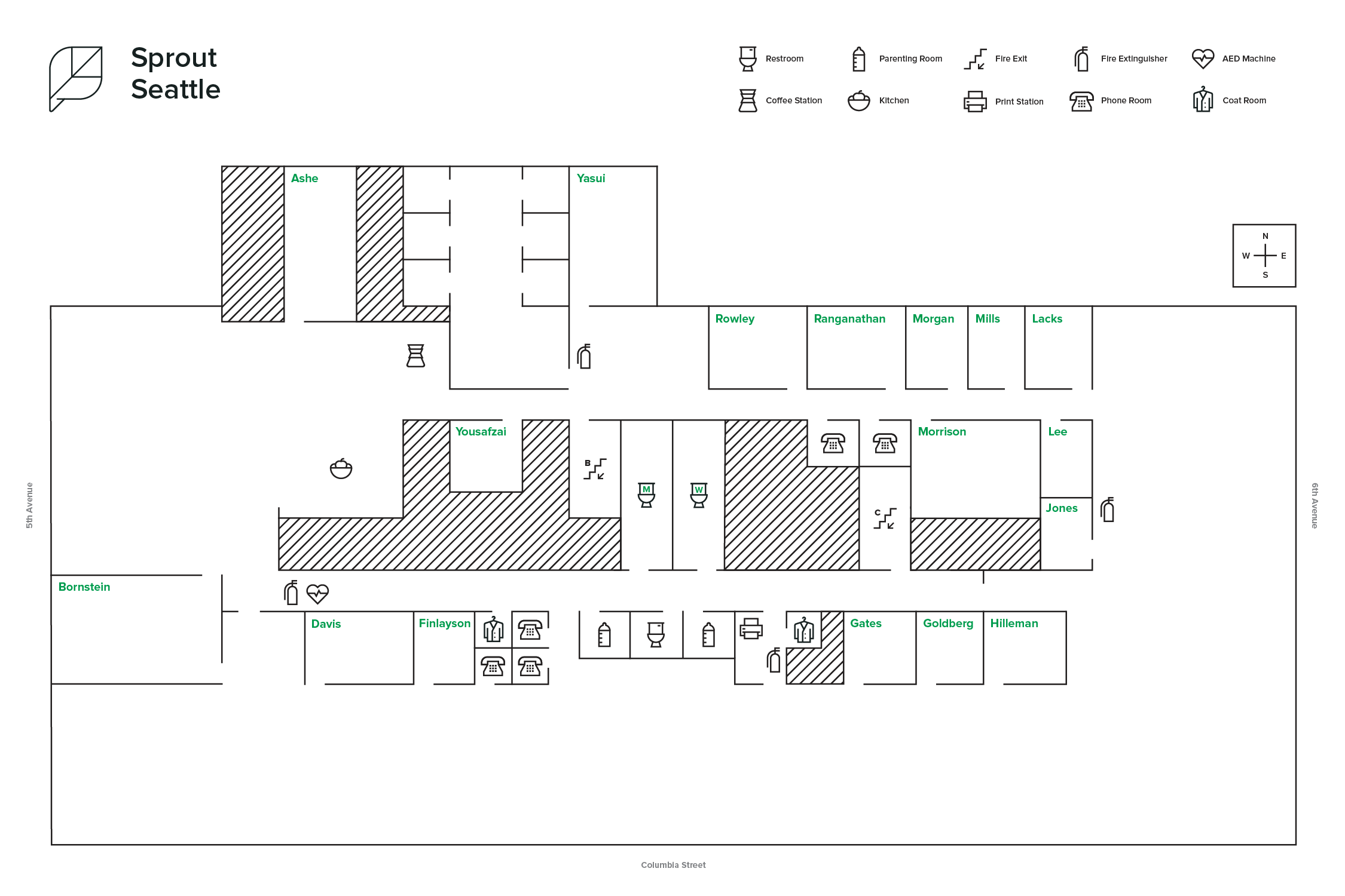
I also advocated for intentional choices around language, opting for “Parent’s Room” instead of the traditional “Mother’s Room” and a statement of gender inclusivity on all restroom signage. Our Seattle office also displays Native Land Acknowledgements prompting the team to recognize and honor the land the office sits on.

